If you haven't had any training in color theory, you may be choosing your colors intuitively based on what appeals to your eye. Knowledge of how colors interact, however, can remove much of the guesswork and help you make safe color choices while you're face painting.
In making color choices, it's helpful if you have a color wheel as I have my trusty color wheel here. You're going to notice one thing about it, it's got colors all the way around the outside, but they're in a very specific order. You can use that order to help you make good choices when you're face painting.

Complimentary Colors:
For example, you've probably heard of complimentary colors. Complimentary colors are right across from each other on the color wheel. And the thing about complimentary colors, is that they're very pleasing to the eye when they're used together - not mixed together, but just used with each other in a composition, a painting, and face painting.
So the complimentary colors that you should know about are blue and orange, red and green, and also purple and yellow. When you use those, it's going to help a composition have more interest to the eye and look better. If you've seen certain artists, you may not even know why they're your favorite, but probably because they're using complimentary colors in some of the pieces that you're looking at.
Triad Colors:
Something else that you can find on the color wheel, are triads. Triads are three colors that make a triangle. So an example would be red, blue, and yellow. That's a primary color triad. If you look at children's toys, a lot of the times you'll see red, blue, and yellow used together - there's a reason for that! It's because again, these colors function very well together.
Another triad that you'll find is purple, green, and orange. Again, those three colors work very well together. So it's not uncommon to see them used. If you start looking at packaging, you're going to see some of these color combinations.
Analogous Colors:
Another set of colors that are very commonly used, are analogous colors. Analogous colors are colors which are right next to each other on the color wheels. So those would be orange, yellow, red, or red, purple, blue, or blue, green, yellow - any of those color combinations work well together. So it's a great idea to use one base color and use some analogous colors maybe for highlighting, or to brighten something up.
The thing you have to watch out for with analogous colors, is that sometimes, because they're right next to each other on the color wheel, they might not give quite as much interest to whatever you're working on. It'll still be beautiful because those analogous colors work well together, but if you want to give it a little more of a pop, take some analogous colors and then choose a complimentary color which is right across from your analogous choice on the color wheel. Say you're doing a butterfly with violet, blue, and green, then you can go across the color wheel and find some orange. And make sure to allow the other colors to dry before adding any other color. If you apply wet paint on wet paint, it'll probably bleed through.
When youre looking at face painting designs by other face painters, the things that you really like, or that you're really drawn to - just look at their color choices. You're going to see some of these principles being used. Sometimes people use them intuitively, but if you know what they are, then you can make very safe choices while you're on the job.
So I have one last word of caution, because that's a very basic look at color theory. I tell my students when I'm teaching painting, you have to be a little bit careful when you're mixing colors that are across the color wheel. If you mix a triad, you will get brown.
So usually that's not a color that you want. If we want brown, we usually will just use a brown color. So be careful when you're using complimentary colors next to each other because where they overlap, you are going to get brown. A lot of times it' really a good idea to deliniate between those colors, and make sure they're very dry before you use them next to each other. Make sure the first color is dry, then use the one next to it. Paint the light colors first, then come in with the darker, more intense colors afterwards. That's another thing you can do to avoid unnecessary or unwanted mixing between your colors. Put black or white between them so that there is a deliniation, a line between them.
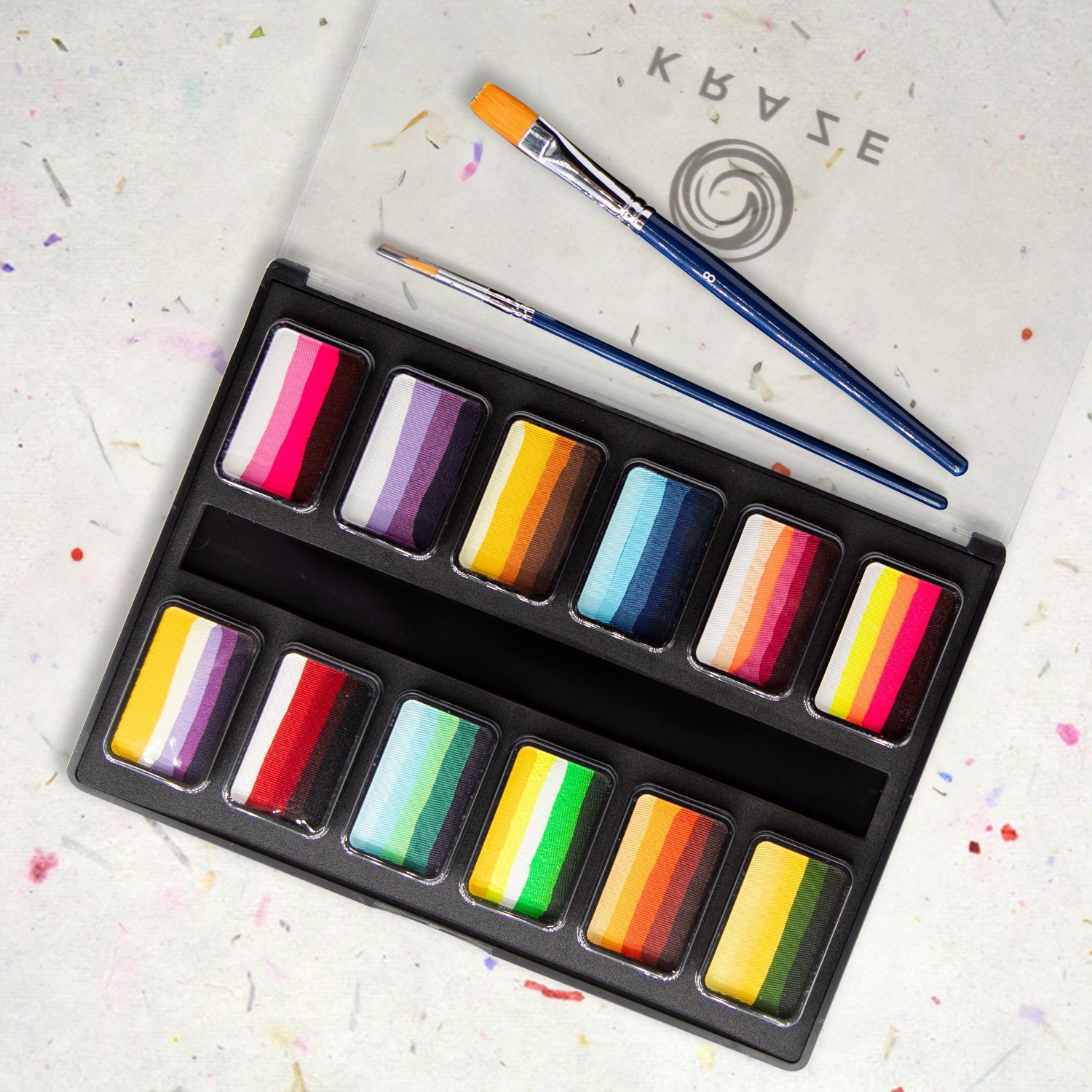
If you're new to face painting and still building your palette choices, I've listed a few palettes in my favorite brands which might help you.
• TAG split cake palette
• Paradise AQ Pro Face Paint Palette
• Wolfe Palette
• Party Xplosion palette
• Kryvaline palette
• FAB palette
Beth MacKinney is the owner of and primary face painter for Face Paint Pizzazz in Elgin, Illinois, and her artwork has appeared in The Colored Palette and SkinMarkz magazines. She services the western and northwestern Chicago suburbs, Chicago’s north side, and the eastern and southeastern suburbs of Rockford. Stop by Clownantics.com to enjoy more of Beth’s face painting tutorials.