 Project, program and portfolio reporting is one of the main services provided by a PMO. It’s also one of the most time-consuming. Finding the data, updating presentations and spreadsheets, getting it to the people who matter before all the information is out of date – it’s a headache for many PMO teams.
There is a solution, and it’s a lot easier than you might think. Use the information you already have in your enterprise project management software tools and draw your reports from there. You can create dynamic dashboards in a fraction of the time it takes to update executive briefing slide decks.
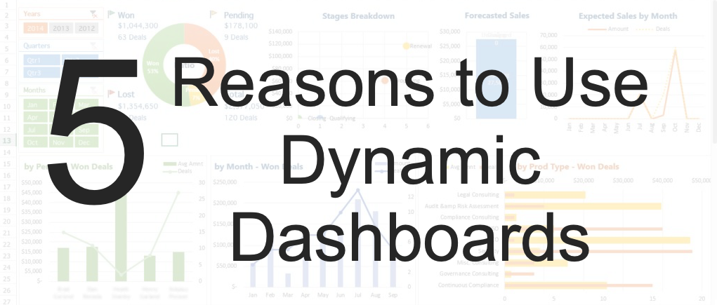
What is a Dynamic Dashboard?
A dynamic dashboard is one that updates automatically with real-time data. Whenever a change is made to a project schedule or record, any dashboard that draws on that information is updated. You get real-time information, every time.
This is different to non-dynamic, static dashboards – the kind that you might build in a spreadsheet for an executive summary report. This kind of dashboard won’t (and can’t) update automatically. There are many disadvantages to using static dashboards including the amount of time it takes to keep the updated. It’s a manual process that is very time-consuming. By the time they reach the intended audience, they are already out of date.
1. They Provide Real-Time Information
Dynamic dashboards can’t be out of date. They always reflect the information in the live project management software. You rely on project teams to keep the information in the tool updated, but as they are doing this anyway in order to effectively manage the projects, business analytics and real-time management information is a happy by-product and doesn’t involve any extra work.
Project reports are available on demand, whenever anyone wants to see them, and they are always a correct reflection of the underlying data in the tool.
2. They Create One Version of the Truth
A powerful reporting engine like Adrega PI gives you a single version of the truth.
When you extract information from different tools and manually create a dashboard in a spreadsheet, there’s a risk that the information is distorted somehow. It might be an accidental distortion, or there might be deliberate manipulation of the data to show the project in a particular way. You can’t do that with a dynamic dashboard.
A dynamic dashboard gives you a single source of information. Everyone sees the same underlying data, even if they choose to present it differently through personalized dashboard widgets or specific reports.
3. They Are Easy to Change
You want to see the data in tabular format? No problem. Prefer a graph? That’s easy too.
Dynamic dashboards have full access to the underlying data. It’s simple to change how that is presented. Everyone has different preferences for viewing data. While you might like to see a long list of milestones, your project sponsor might prefer to see them on a timeline.
Experiment with a few different ways of showing the data until you find one that gives you the information you want in a meaningful and informative way. Then save your preferences!
4. They Allow Drill Down
A huge benefit that dynamic dashboards have over static, spreadsheet or presentation-based dashboards is the ability to drill down into the underlying data. If you want to see what is causing that blip on a graph, click on it and bring up the data underneath. Drill down to the project and then, if necessary, to the task. You’ve got everything at your fingertips.
If you’re presenting information to executives, this is a definite confidence builder! Any question they ask you about anomalies in the data can be answered with a few clicks. Compare that to your static graphics on a slide. If you don’t immediately know the answer, you’ll have to go away, dig through your records and find out. That isn’t the impression you want to leave your execs with.
5. They Provide a Consistent View
Dynamic dashboards are configurable, but once you’ve set up the reports, graphs and tables you want to see, they remain. You can, of course, change what you see in the dashboard if you need to. However, keeping a consistent view of the project lets you compare progress over time, and compare different projects, more easily.
There’s a chance that you don’t have that level of repeatability and comparability with static dashboards. We spoke to one project manager recently who had looked back over a year of presentations to her steering group. Almost every slide deck was different, although they were all steering group reports. When she picked up another project from a manager who was leaving, she saw that manager’s steering group deck was different again. Project sponsors in her organization had no consistency with what they were being offered by project managers, even within the same PMO.
Setting up project dashboards and creating common views is the solution. Project managers and project sponsors know what they are looking at. They have the information that’s relevant, in a consistent way.
There is some overhead with setting up dynamic dashboards for the very first time. You have to configure your reporting tools to give you the views you want. You may want to create different views for different project roles. Sponsors, for example, need to see different information to team managers or project managers. However, once that task is done, it’s easy to maintain.
The other thing to consider before launching dynamic dashboards is the quality of the underlying data. Dashboards that draw information from the project management tools will quickly show which project managers are using the full scheduling and risk management capabilities of the tool. You’ll quickly be able to identify project teams that aren’t updating timesheet information or sharing their actual task completion dates.
Project reporting on a dynamic basis is only as good as the underlying information. Work with your project teams before launching a dashboard to make sure they’re putting in everything you need to get the right management information out.