Trends are irrelevant in credit union website design

I was talking with a credit union marketer a few days ago who wants to redesign his website, but he’s facing resistance internally because some of his senior managers and board members say, “All the new credit union website designs look the same right now. So, let’s wait for the next design trend to come along before we redesign our website. That way, we can be at the forefront, instead of behind the trend.”
“How do I respond to their concern?” he asked me. I told him, “In truth, design trends are irrelevant and sometimes even wrong.”
Right now, in the world of credit union website design, there’s a belief that being trendy is important, even essential. Many credit unions are eager to follow the latest and slickest design fad. In reality, it doesn’t matter what the credit union down the street is doing; paying attention to design trends is just keeping up with the Joneses.
What really matters is design data. In other words, you should design your website based on what actually attracts members and borrowers, instead of designing based on what every other credit union is doing. By designing with data, you can create a truly superior credit union website that gives trendy sites the People’s Elbow (courtesy of Dwayne Johnson). Below, I’ll tell you how you can get that data.

Source: The New Yorker
Is trendy the same thing as effective?
Whatever generation you grew up in, you probably got caught up in a trend or two. Perhaps you had a killer mullet at some point. Maybe you couldn’t resist those ultra-low-rise jeans, or maybe you still love belting your favorite boy band songs in the shower.
There’s nothing inherently wrong with trends, but if you follow them obsessively, you’ll end up with a goal that has a single result. If you try to be trendy, you’ll probably succeed—at being trendy.
For example, many credit unions currently use sliders (aka carousels) on their homepages. Sliders are used to promote various credit union products and services, moving across the screen as visitors peruse your homepage.
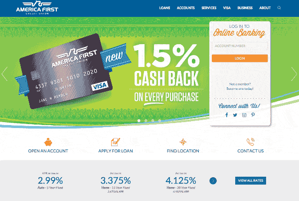
An example of a slider on americafirst.com
To some marketers, sliders might seem like a good idea, but the data is overwhelmingly against them. Typically, 1% of people (or even fewer) will ever bother to click a slide. Site visitors dislike sliders because they are confusing, distracting, and resemble ads.
Alternatively, data shows that you are much better served by featuring personalized or interactive content on your homepage, which increase engagement and keep visitors on your site.
Aren’t the real goals of your credit union website to get more members, deposits, and loan applications? To best achieve those real goals, you’ll need to be more than just trendy, because if you simply follow trends you can run into major pitfalls—like the pitfall of the slider trend. Instead, when you use to data to make design decisions, you end up with a website that’s both beautiful and achieves your goals.
How to design with data
In order to design with data, you need to gather data. Fortunately, this is 2018 and you have thousands upon thousands of free resources at your fingertips.
When you’re searching for an answer to an important credit union website design question, such as “how should I set up my forms?” or “what CTA would work best on this page?” you might check Google for an answer. Instead of going with the advice of the first blog post in the search results, make sure the article backs up the suggestions it makes. Double check that there’s actual data behind the claims, instead of just vague supporting text.
We recommended using reputable, evidence-focused sites like GoodUI.org and nngroup.com to learn data-proven design patterns. Their websites are chock full of takeaways, and even include juicy details on experiment setups and certainty levels.
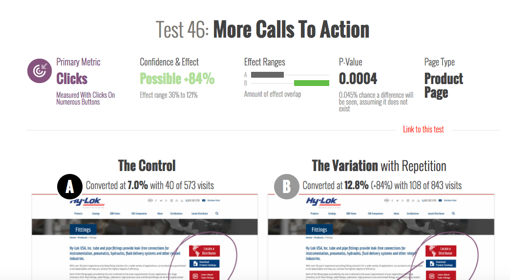
Detailed experiment data from GoodUI.org
You can also gather your own data by conducting tests and running analytics on your own credit union website design. Here are few research-focused resources to help you get started:
- A Beginner’s Guide To A/B Testing
- How to Make Your Credit Union’s Site Navigation Completely Intuitive
Going the extra mile to design with data is harder than following trends, but it’s incredibly rewarding in the long run. You’ll end up with a website that’s more engaging for your users and you’ll be a marketing rockstar.