5 signs it’s time for a new credit union website design

Your website is your most visited branch.
As your most important branch, ideally you continuously invest in your credit union website design to improve its experience and increase the number of applications you get from members and nonmembers. Along with continuous improvements, a complete redesign is necessary every few years because the Internet changes so rapidly—it basically runs on doggy years.
How to know it’s time for a complete redesign
How do you know if it’s time for a complete redesign? In short, if your website offers a poor user experience (by today’s standards), isn’t helping your credit union grow, or even poses a legal risk (e.g., ADA compliance), then a complete overhaul is probably a wise choice. Below are five telltale signs that it’s time for a completely new credit union website design.
#1 Is your site mobile friendly?
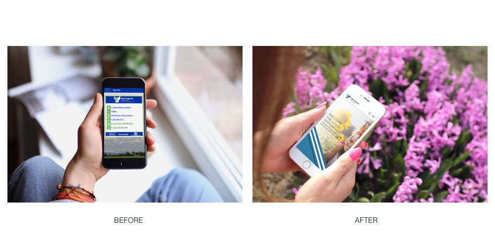
Mobile responsiveness is key for successful websites, since most Americans spend 69% of their total media time on their smartphones. If you have a terrible mobile experience, you’ll find potential members leaving quickly—this can be measured with a metric called “bounce rate”. Fortunately, redesigning your website using current design and coding practices will make your website work amazingly on every device.

#2 Is your site ugly?
The truth is, people don’t trust credit unions with ugly websites. We’ve all been to an outdated website that we felt suspicious of. Maybe it had unusual, unappealing fonts, or just felt way to bare bones. If you have an ugly design, potential members of your credit union will visit your website—and then once again, leave immediately.
#3 Is your site ADA accessible?
ADA compliance is a major reason to consider a redesign right now. Lawsuits for non-compliant websites are on the rise, and though 100% compliance is practically impossible, there are several steps you can take to become more accessible and reduce the risk of getting a demand letter. A redesign can help you seamlessly incorporate these steps into a better looking, better functioning website.
#4 Is your site hard to use?
Usability is another important factor to consider in a redesign. So often we think of design as just the aesthetic appearance of a site. However, how your site functionsis also vitally important. This Usability Testing Worksheet can help you run tests to determine if your credit union website design is user-friendly.
Another one of the most common reasons people bounce from a website is they can’t find what they’re looking for. That means if your site isn’t well-organized, many of your visitors will never read about your great rates or awesome perks.
#5 Does your site communicate your brand?
Does your website represent who you are as a credit union? Why should someone bank with you instead of any other financial institution? Communicating your brand is incredibly important to good marketing, but too often we see credit union web designs that don’t help non-members understand why they should join or even care. If this describes your website, it’s time for a redesign. This Credit Union Website Strategy Guide can help you invigorate your brand in preparation for designing a new experience.


