 Deltek Acumen scatter charts are useful for identifying patterns or correlations between duration and cost in a risk adjusted schedule.
Scatter plots use dots to present values for two different numeric variables. Each dot on the scatter chart is an individual data point. The scatter plot may have patterns that warn of issues that require further investigation, such as gaps in values or outlier data points. Scatter plots are most helpful for observing relationships between variables. In Deltek Acumen’s risk sensitivity feature, quickly assess the relationship between schedule duration and cost by showing their interaction on a scatter plot. On the scatter chart we can discover whether schedule and cost have no relationship, a linear relationship, or, perhaps, a non-linear relationship. We can also observe whether these patterns are null, moderate, or strong. In this way the scheduler gets a good handle on the time/cost correlations in the Monte Carlo analysis for a risk adjusted schedule.
This article introduces and demonstrates Deltek Acumen scatter charts to show their utility for observing schedule and cost patterns and correlations in a risk adjusted schedule.
On the scatter plot we first look to identify notable patterns in schedule data. Figure 1 displays example scatter plot data clusters, gaps in values, and outliers.
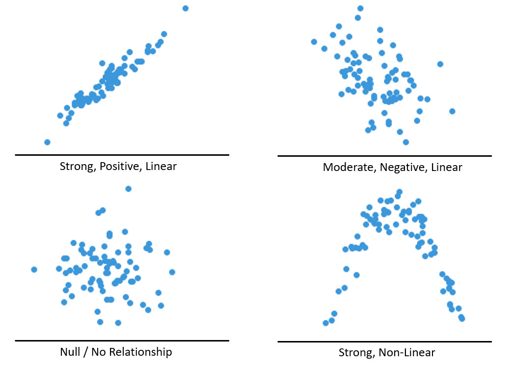 Figure 1 (graphic courtesy of chartio.com)
We divide data points into groups based on how closely the points cluster together. This is our data clusters scatter plot in Figure 1. Additionally, we can look for unexpected gaps in the data. This may indicate a risk window or other similar schedule risk event in our schedule. Note the Figure 1 Gap in Values scatter plot. Of greatest concern are any outlier points. Refer to the Outliers scatter plot, Figure 1. Outliers on the scatter plot should raise a warning flag that something may be amiss in our model and/or Monte Carlo analysis, and we need to further investigate the schedule and cost models.
In scatter plots we look to identify correlation relationships. If we are provided a scatter chart horizontal value, we want to arrive at what a good prediction would be for the vertical value. Often the horizontal axis denotes the independent variable and vertical axis the dependent. In the scatter plot we can classify the relationships between variables in a few ways: positive or negative, strong or weak, and linear/non-linear or null. In Figure 2 we have example scatter plots, according to these classifications.
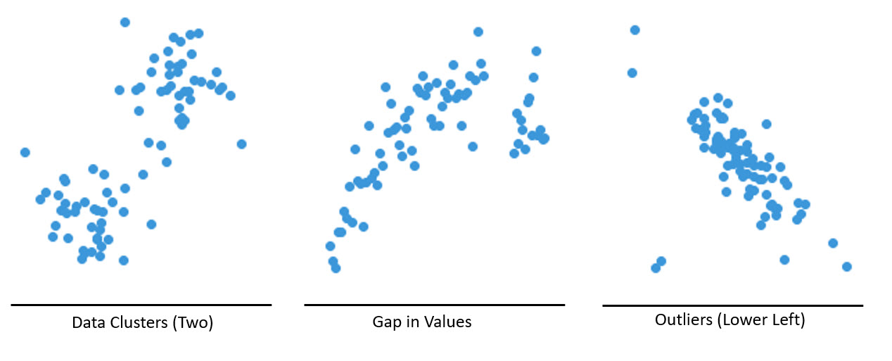 Figure 2 (graphic courtesy of chartio.com)
Look at the strong, positive, linear relationship in Figure 2. This is the kind of pattern we want. The moderate linear pattern in Figure 2 is also good. If there is no relationship, Figure 2, we do not have correlation. The most unusual pattern is a strong non-linear correlation, Figure 2.
In Figure 3 we have our demonstration Primavera P6 Professional project schedule.
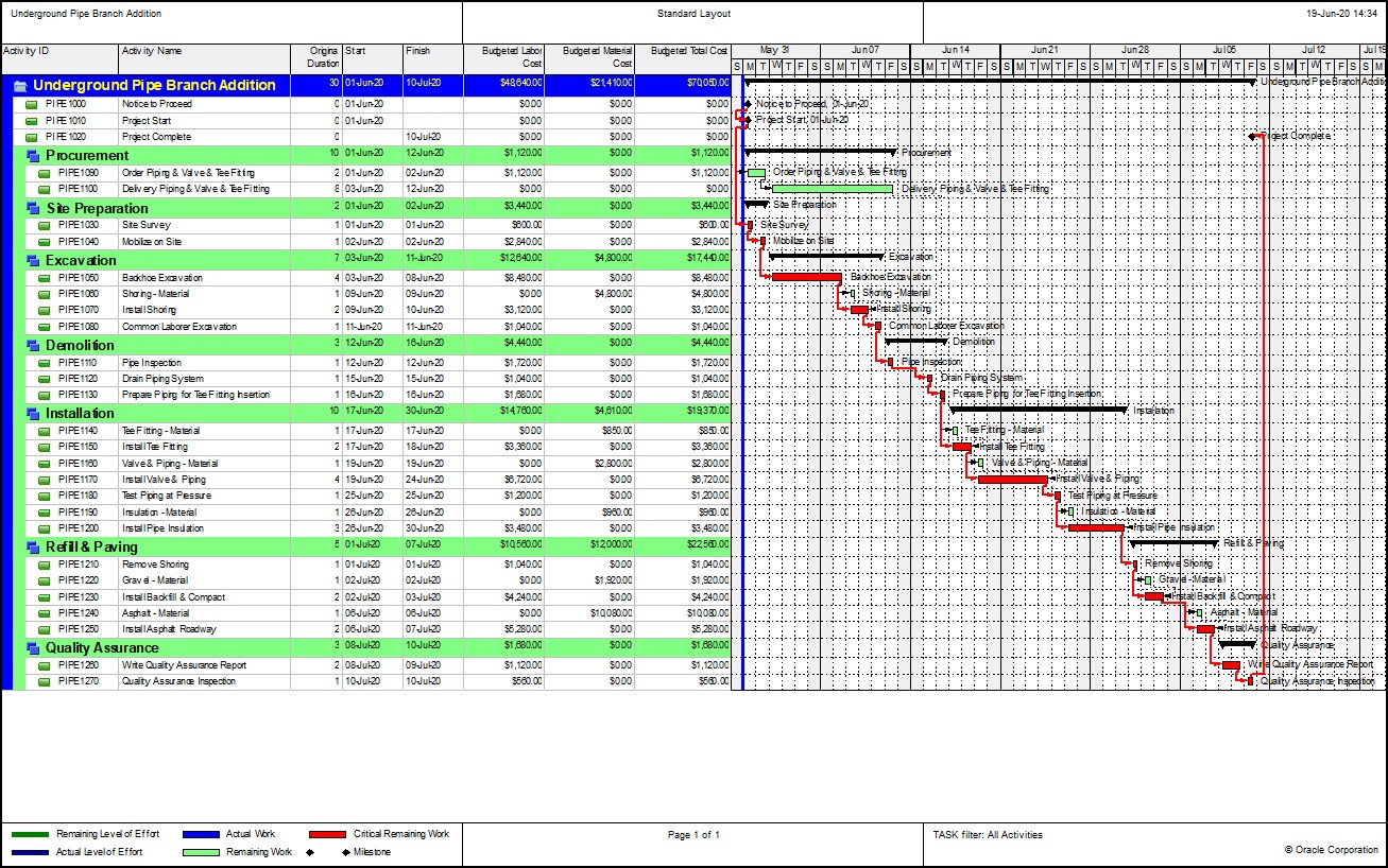 Figure 3
This is an Underground Pipe Branch Addition project. The deterministic project finish is 10-July-2020. Figure 4 displays this project in Deltek Acumen S1 // Projects.
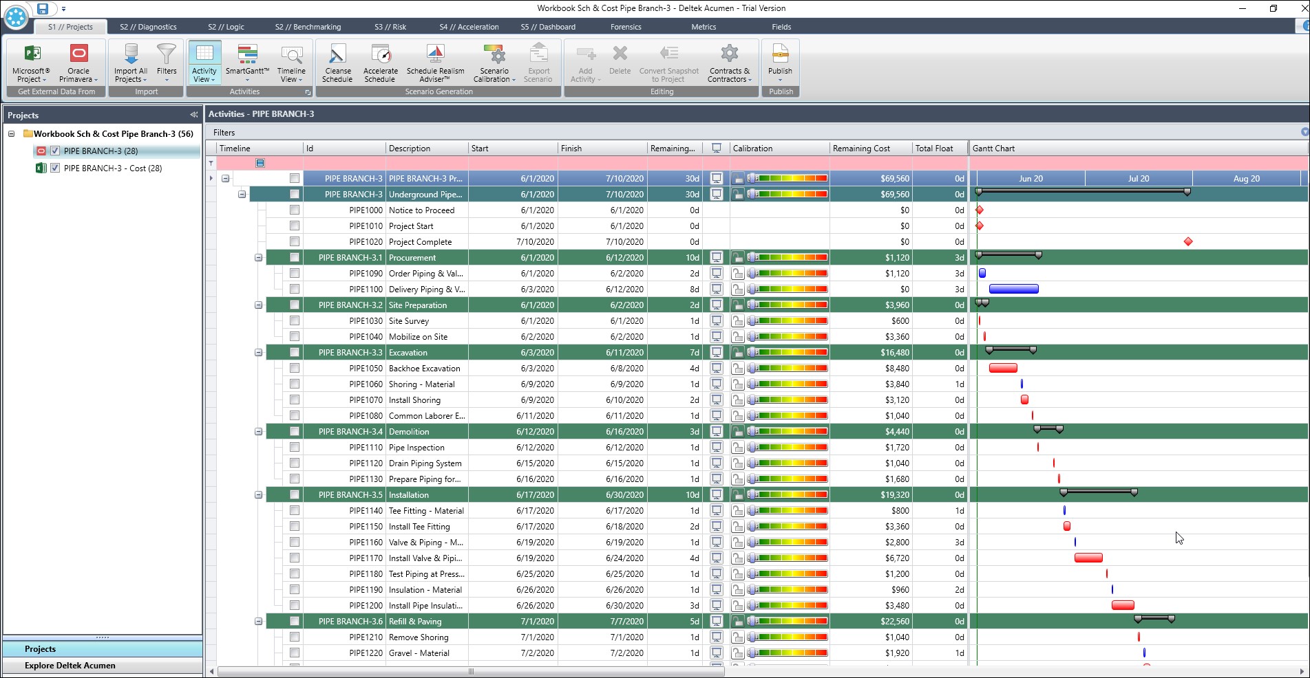 Figure 4
We have both a risk adjusted schedule model (Pipe Branch-3) and cost model (Pipe Branch-3 Cost), Figure 4. In Figure 5 we set up to run an Uncertainty and Risk Events Run Risk Analysis scenario on the Cost Model.
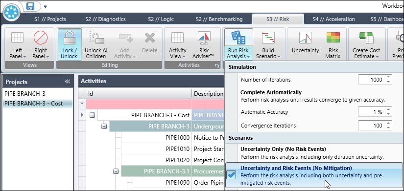 Figure 5
We run the risk analysis in Figure 6.
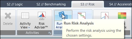 Figure 6
Figure 7 displays our histogram results.
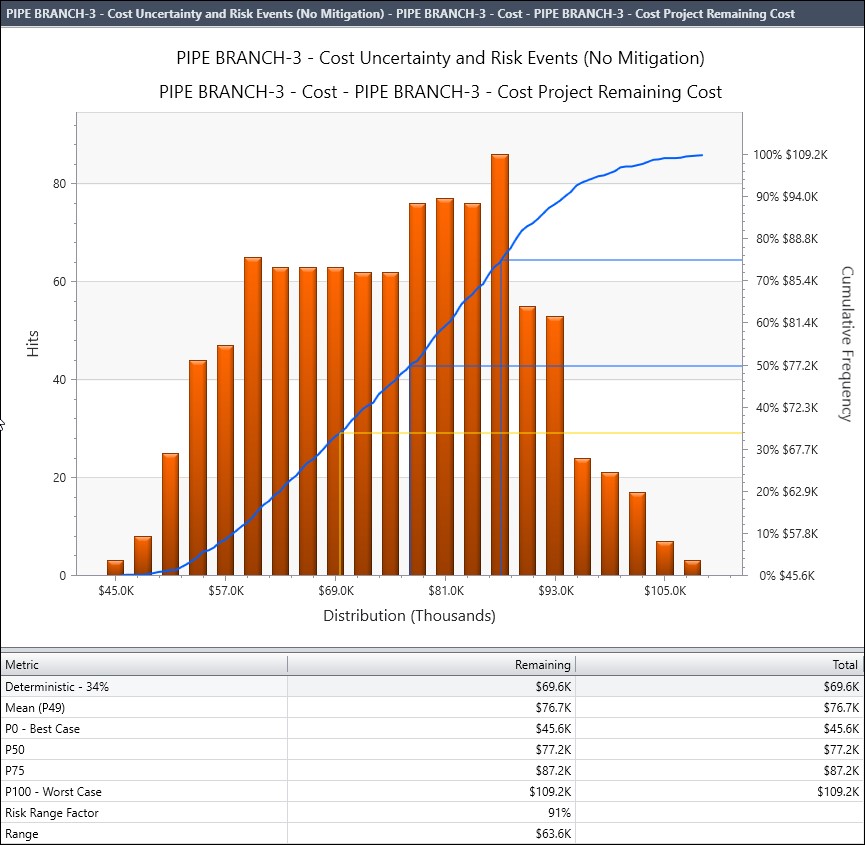 Figure 7
Then we select the Pipe Branch-3 schedule model, Figure 8.
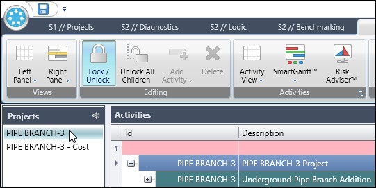 Figure 8
Continuing, we choose Right Panel | Risk Sensitivity, Figure 9.
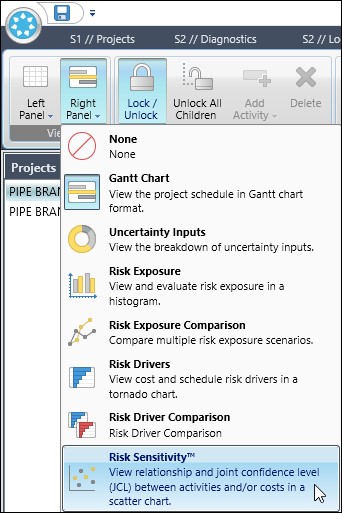 Figure 9
In the lower right area of the Risk Sensitivity dialog screen we select the Configure button. Note that In the Risk Sensitivity dialog, the horizontal independent variable is Finish and the vertical dependent variable is cost, Figure 10.
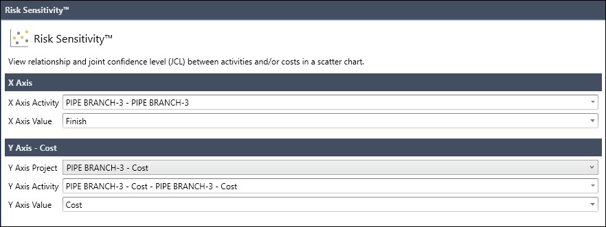 Figure 10
Then again in the lower right-hand corner we choose the Analyze button. The resulting Scatter Chart is displayed in Figure 11.
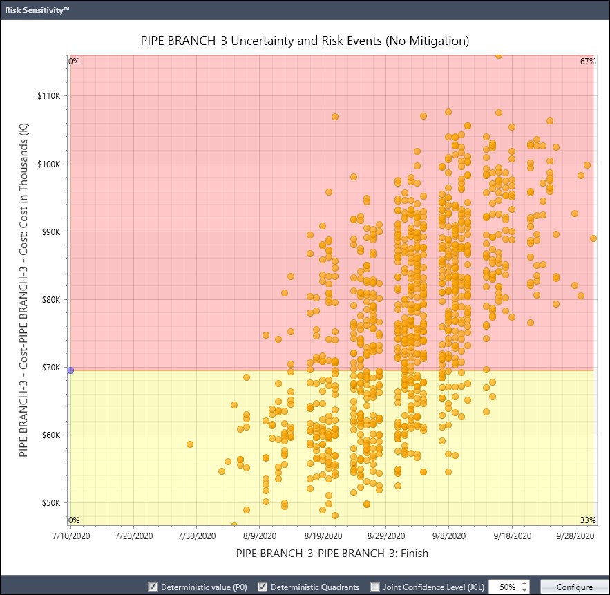 Figure 11
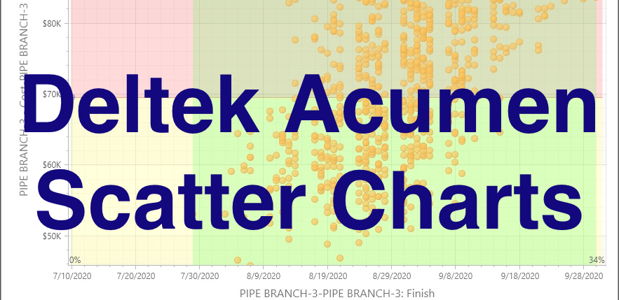
You will observe right away that the deterministic end date is 10-July-2020 and the cost is $70K. Well, there is a significant gap between the deterministic end date and the scatter plot values. This is because the risk adjusted model has an Eagle Nesting Season risk window, Figure 12, where no work can be executed when eagles are nesting nearby the outdoor jobsite.
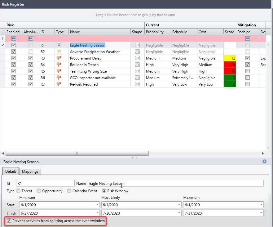 Figure 12
Also, note that the option ‘prevent activities from splitting across the event/window is set’. This means all the work must be performed either before or after the risk window, so no splitting of work. The start of the risk window is the commencement of the project, 01-Jun-2020 and its finish Minimum, Most Likely, and Maximum dates are 27-June-2020, 20-July-2020, and 31-July-2020. You will observe on the Scatter Chart that the first non-deterministic data point is 29-July-2020.
We can additionally plot the Joint Confidence Level (JCL), which provides insight into meeting both schedule and cost targets, at a specified P-value (probability or confidence level). In Figure 13 we have our Scatter Chart with JCL curve for an 80% confidence level.
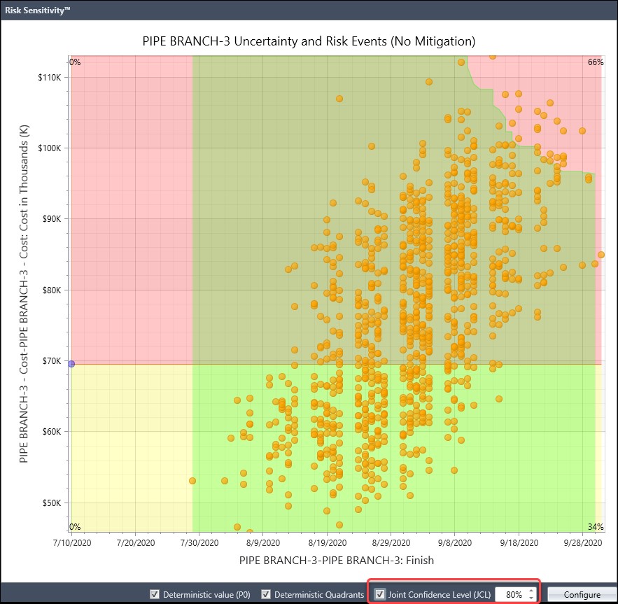 Figure 13
Now if we want to see our scatter plot in all four quadrants, we simply disable the ‘Eagle Nesting Season’ risk window event, Figure 14, and recalculate our histogram and Scatter Charts again.
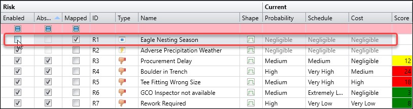 Figure 14
Figure 15 displays a Scatter Chart of our Pipe Addition project when the Eagle Nesting Season risk window is disabled.
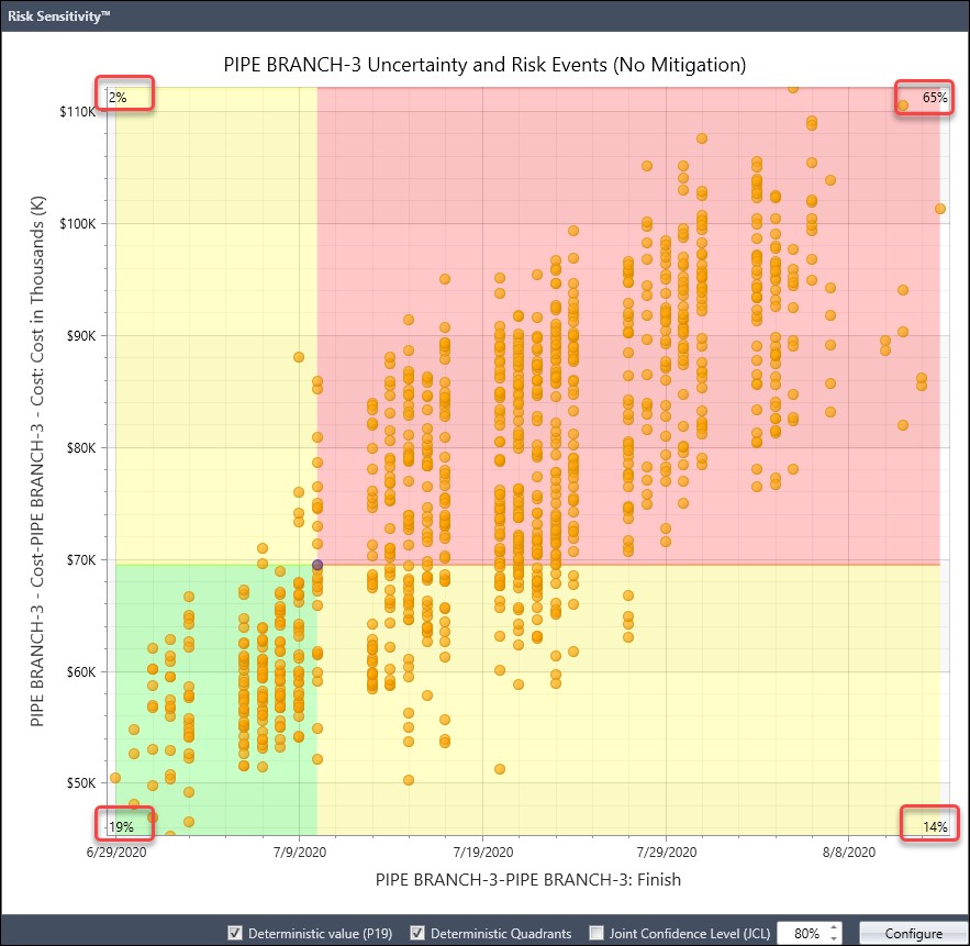 Figure 15
As you can observe we have a moderate positive linear correlation between schedule duration and cost. Further, we note in the lower left-hand quadrant that 19% of the time, schedule and cost were before or less than the deterministic schedule and cost values 10-July-2020 and $70K. And in the upper right-hand quadrant that 65% of the time, schedule and cost were longer or greater than the deterministic results. Schedule and cost were earlier and more expensive than the deterministic 2% of the time in the upper left-hand quadrant. They were later and less expensive 14% of the time in the lower right-hand quadrant.
Summary
Deltek Acumen scatter charts can be especially useful for finding patterns in the results of the Monte Carlo analysis for risk adjusted schedules. We can identify data clusters, gaps, and outliers. Outliers are of particular concern. Additionally, the scatter plot can pinpoint null, linear, or non-linear patterns and whether these patterns are moderate or strong. The JCL curve provides the likelihood of meeting schedule and cost targets at a specified probability.
Finally, each quadrant of the Scatter Chart indicates the percent of the time Monte Carlo analysis iterations fell in the respective quadrant. And each quadrant is defined by whether the schedule was before or after the deterministic finish date and the cost was greater or less than the deterministic cost.
Consult the blog here at chartio.com for example scatter plots and a scatter plot primer.